Visualizing customer profitability with the whale curve
As the coronavirus pandemic continues, many businesses are struggling to grow, or even sustain their current value. Engaging in a robust profit analysis of your business can lead down a road of answering tough questions, such as: how well do you know your customers or do you know which customers are increasing your profit margins and which are not? In the world of business, time is money – and leveraging data visualization (data viz) to efficiently and effectively perform profit analysis can greatly speed up your time-to-insight, giving you a fighting chance at making adjustments to keep your business relevant in this current economic landscape.
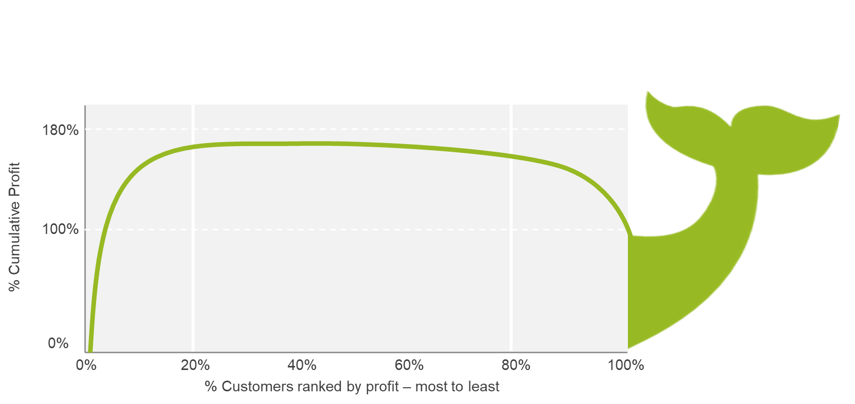
One such data visualization to leverage for profit analysis is the age-old but powerful “whale curve” – earning its name for appearing to be in the shape of a whale’s back. The whale curve effectively visualizes which customers are profitable for your business, which are breaking even, and which are unprofitable. A whale curve is a brilliantly simple, but effective line chart, plotting the percentage of cumulative profit on the y-axis and the percentage of customers ranked by profitability (most to least) on the x-axis.

The ensuing whale curve visual provides an easy-and-quick-to-understand picture of customer profitability. The whale curve picture helps business leaders streamline their reporting as they can visually see which customers are profitable versus spending hours analyzing thousands of rows in a spreadsheet.
The following examples of whale curves will outline some differences to provide a better understanding of data visualization.
Profitable customers

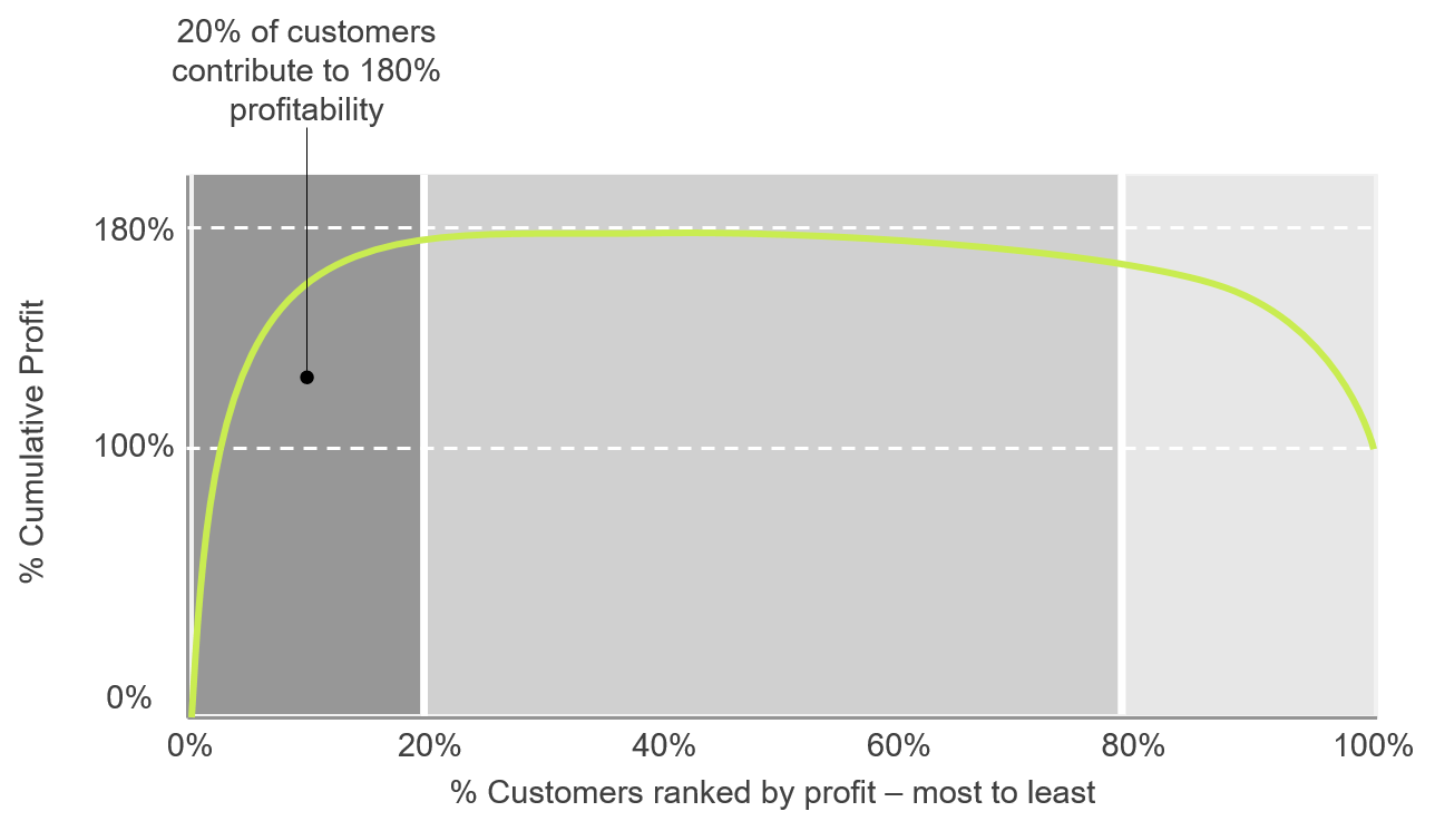
In this example, 20% of your most profitable customers are generating 180% of your overall profitability, as shown on the left side of the whale curve. These customers are providing the highest profit margin within your company; any future business decisions should not marginalize this client basis as it may result in a loss of income – ultimately reducing the health of your organization. Drilling down into these customer metrics and insights, business leaders should ask themselves these further questions about the customers that make up this 20%:
- What are the factors that led to these customers being the most profitable?
- Who are the sales reps for these customers, and what actions and behaviors did these sales reps possess that helped them be successful with these customers?
- Are there any opportunities to provide additional services to these customers?
Business leaders often skip over the areas of their company that are thriving, but by understanding the actions and behaviors that are driving high customer profitability, you are gaining an understanding of what and why something is performing strong and how to replicate that within other areas of your business.
Break-even customers

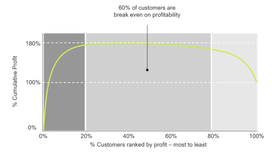
In this example, the middle section of the whale curve captures the 60% of customers that are breaking even on profitability. The revenue these customers generate is negated by the costs incurred to serve them. As your business leaders investigate these customers further for a better understanding of their profit margin, consider asking these questions:
- What are the customer attributes?
- How long have they been customers?
- What products are they buying?
- Who are the sales reps servicing these customers?
You cannot manage what you don’t measure. If a customer level ranking of profitability has never been performed before, shining a light on customers that just break even on profits is a monumental step forward. By identifying this large percentage of your customer base that is essentially untapped profitability, you can start to develop strategies for moving these customers from break even to profitable.
Unprofitable customers

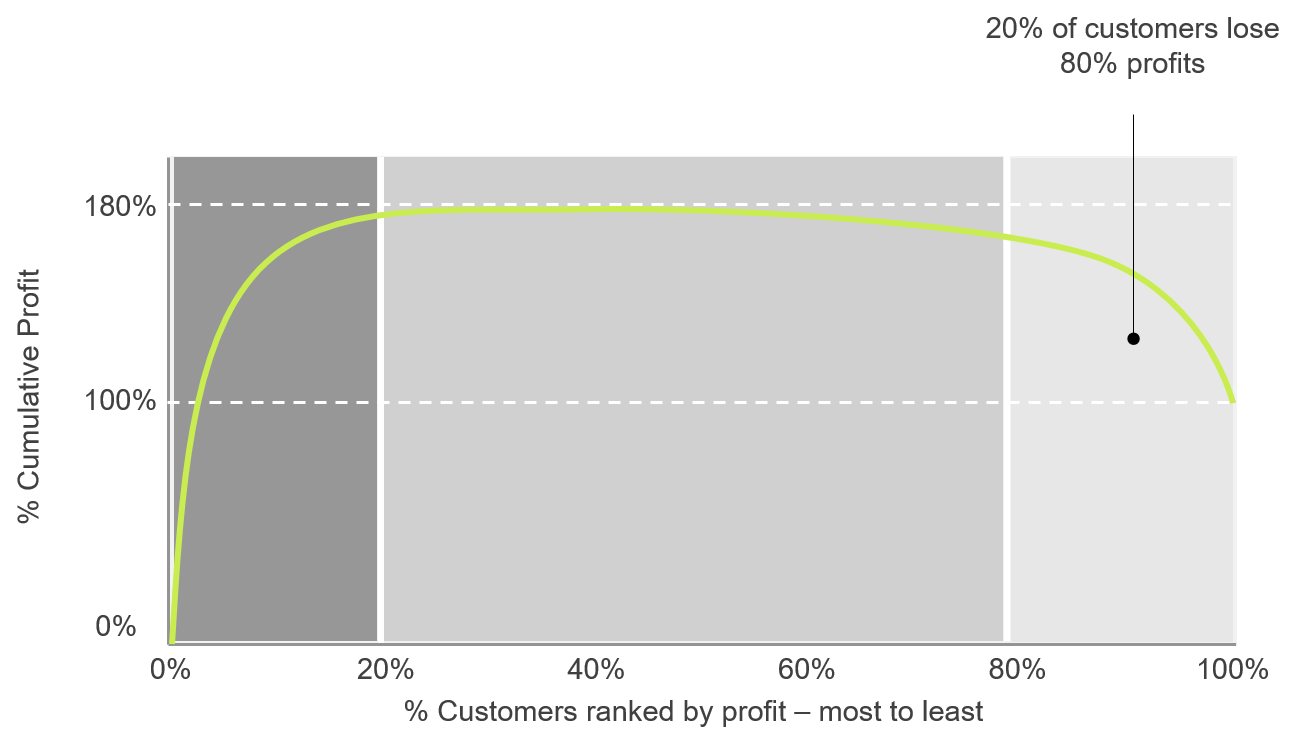
In this example, the right side of the whale curve highlights the 20% of least profitable customers that are responsible for tanking overall profitability by 80% to the eventual realized 100%. All business leader must drill into this list of customers to understand why they are draining overall profits. Some examples of follow-up questions to ask are:
- Why are the costs of serving these customers higher than revenues?
- Are there special circumstances or exceptions outside normal operations to serving these customers?
- What is the level of service and attention given to these customers by the sales and customer service teams?
- Do these customers align and support the mission and overall strategy of your business?
By discussing and answering these questions, business leaders can better provide clarity and focus when aligning actions and behaviors to serving these customers, ultimately resulting in better achievement of your organization’s goals.
When it comes to engaging in a customer profitability analysis, the whale curve is a great example of how data visualization can effectively tell a story that provides business leaders with insights to help them grow customer relations, and ultimately their organization.
For more information on this topic or to learn how Baker Tilly can help, contact our team.
